Karma Charging
Building Website and App Integration for E-mobility company
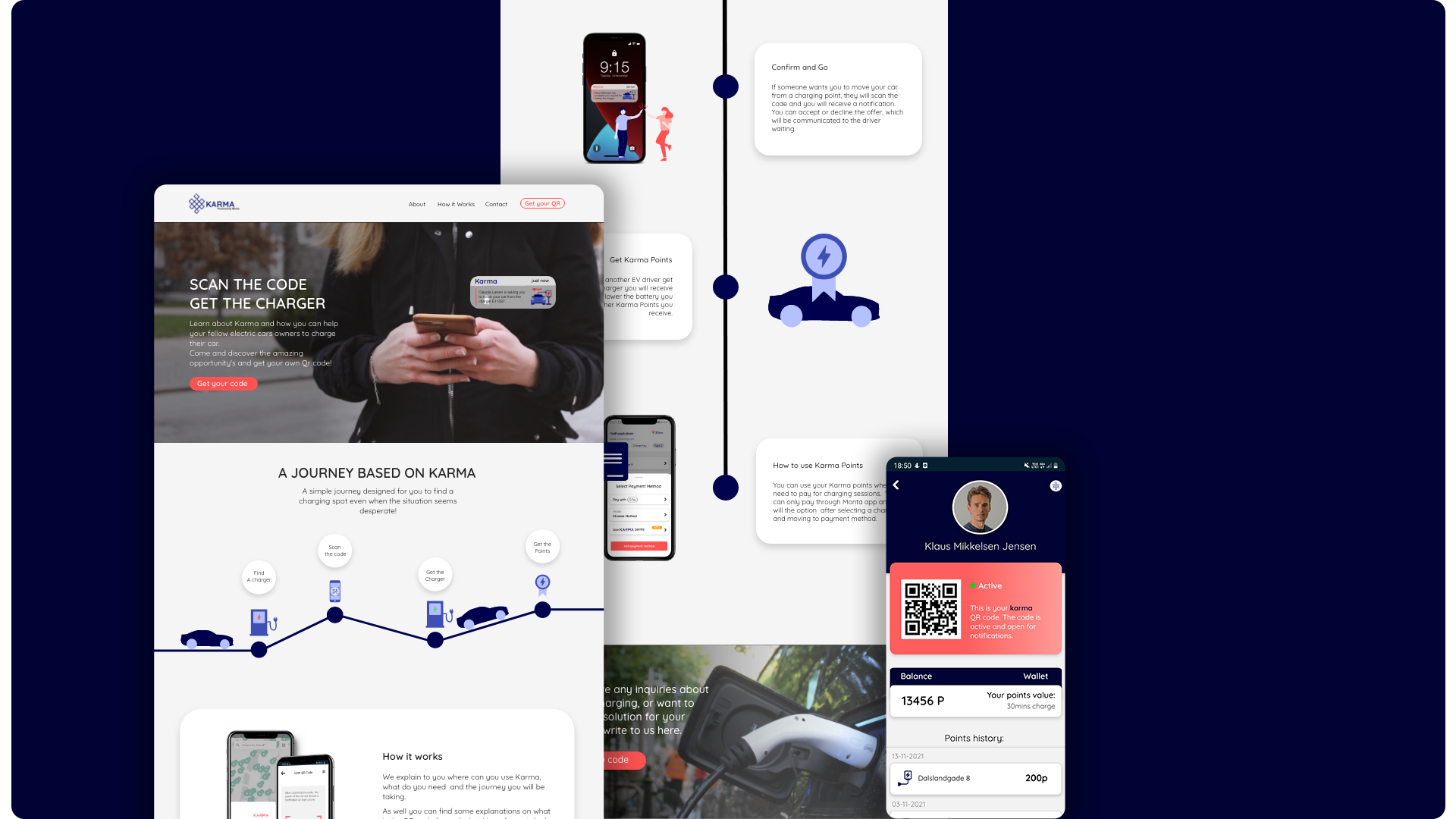
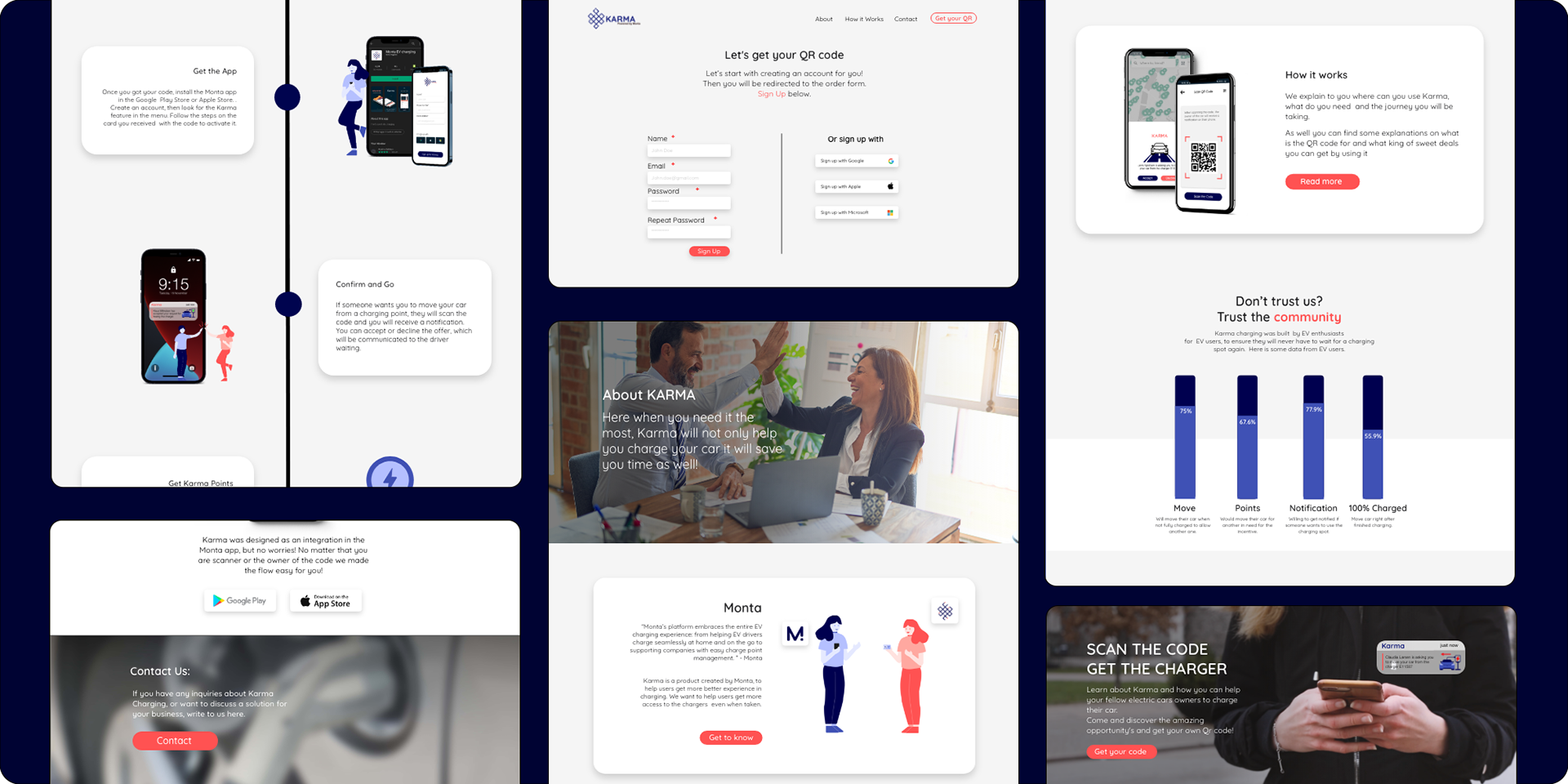
About KARMA
Karma Charging was an idea envisioned by Monta to solve the problem of waiting in line for free chargers that are occupied by people who are not powering their car or have finished so.
Client:
Monta
Problem:
Queuing at charging stations because drivers do not remove their cars after they are fully charged, keeping the spots busy for extended period of times.
Solution:
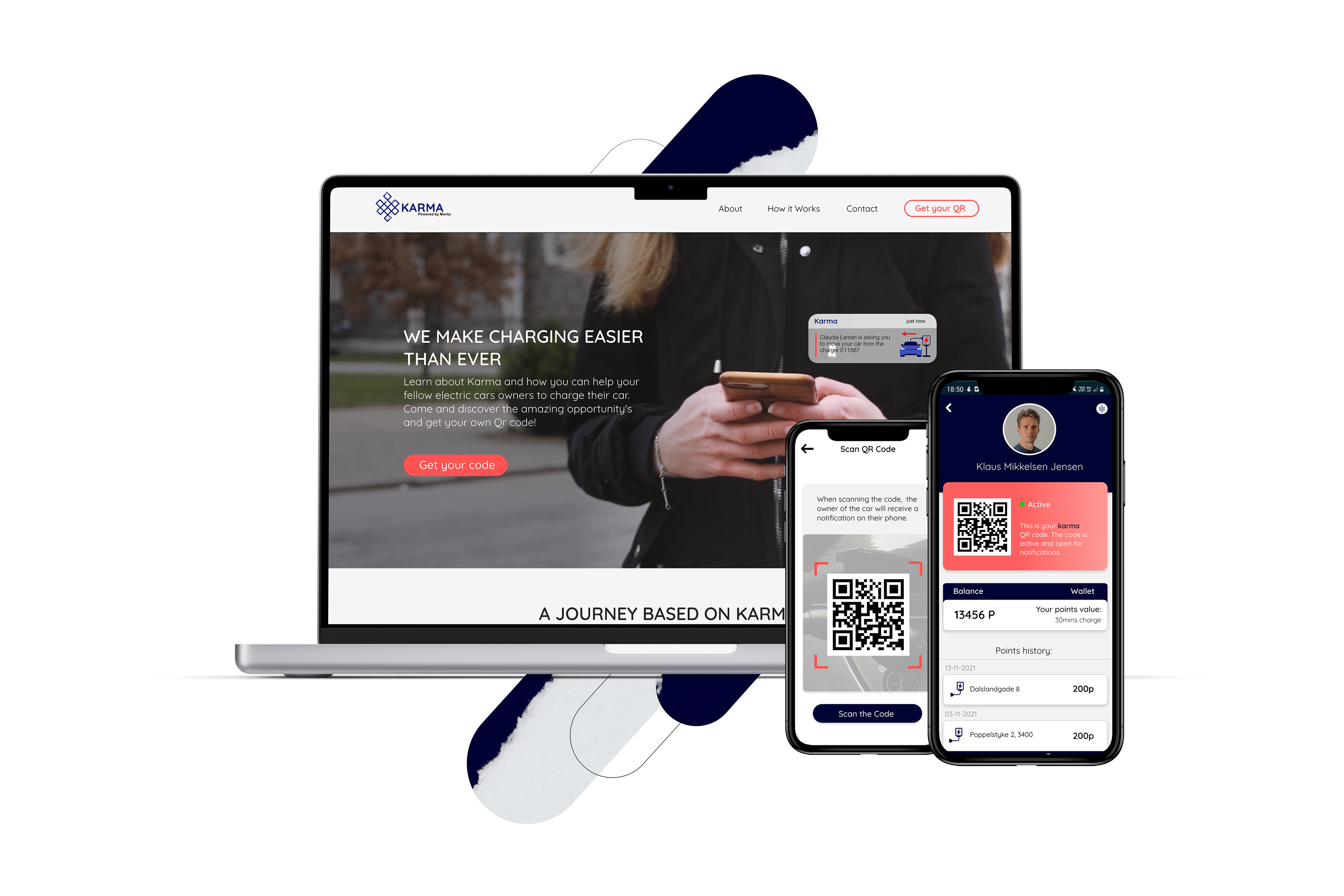
QR scanning system with push notifications and incentives
Role: UX and UI designer. Content production
Process:
This was a group endeavour and the process started by understanding what our client (Monta) identifies as a problem and what would be the desired outcome. Following, we did researching to identify the target audience, their pain points and needs, and what they expect from this kind of service.
Once we managed to gather some data, we analysed it and defined a clear and detailed project plan outlining the features and functionality of the website and app integration.
The next step was to create wireframes and mockups of both the website and app, and to test and iterate on different design concepts. In terms of design language, we were provided by Monta with their brand book and vision so we used elements as color and typography in correlation with the brand identity.
The testing phase had to be skipped because of time considerations, so we just moved to the development stage once the company was satisfied with our work.
NB! Karma was a concept project so it never really moved to a V2 or went into deployment because of different priorities in the company at that time.
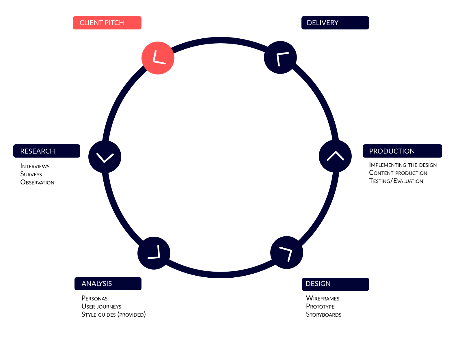
Research
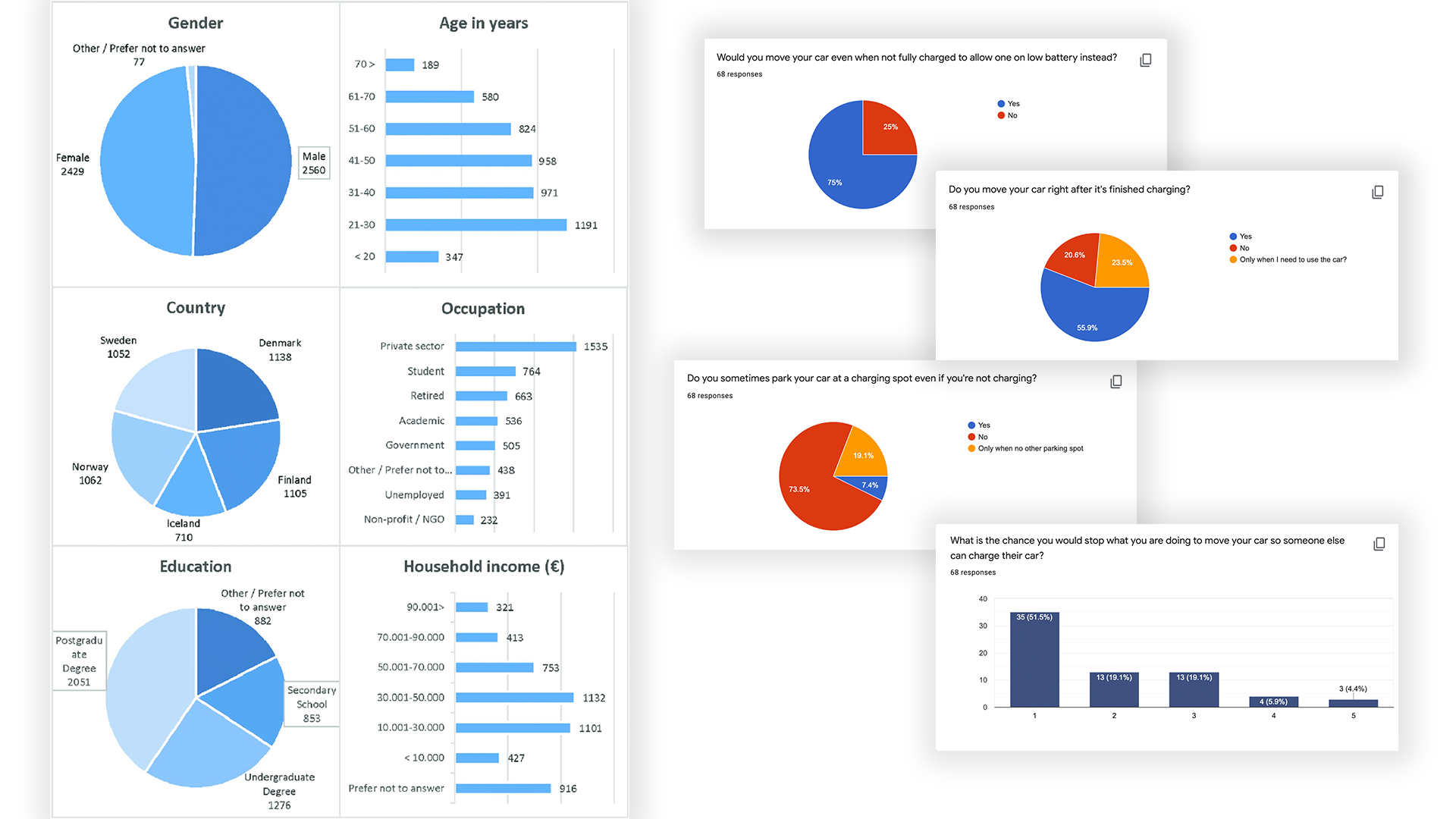
We used a form to identify the user journey, needs, and pain points in the context of designing the process from point A (a person needing a spot) to point B (the person at the other end being willing to move their car). This method helped to gather feedback and information directly from the target audience.
We learned valuable insights about their charging habits, their experience with transportation, their need for an EV app and their spirit of community. All this information helped us develop a better user experience.
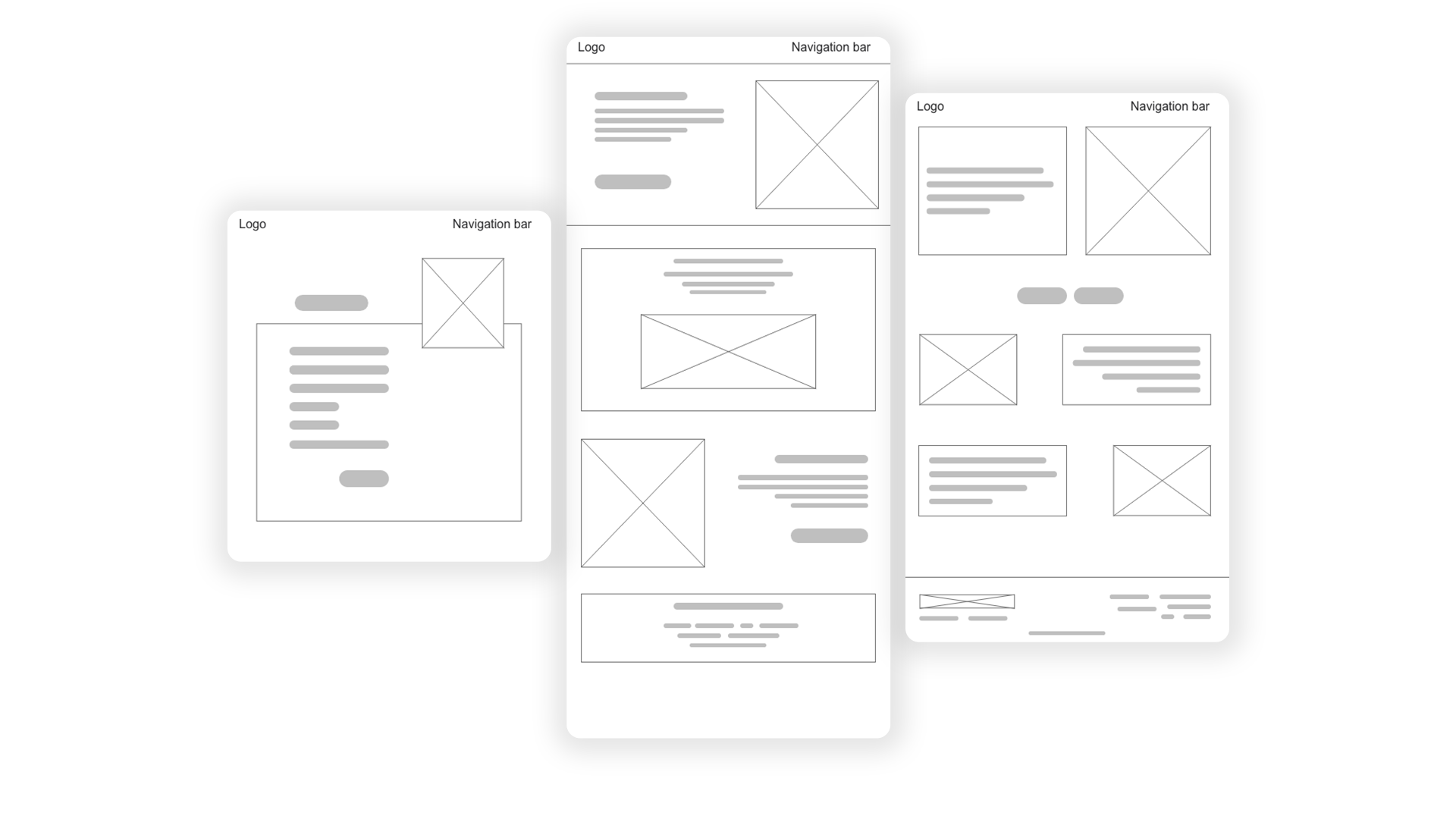
During the process of creating the wireframes, we determined the overall layout of the website, including the number of pages, the layout of elements on each page, and the overall flow of the website.
We started with raw, hand drawn sketches, and we later moved to refine and iterate on the design to create a detailed wireframe for each page of the website. We discussed each other ideas and moved one step at a time with adding buttons, laying the text sections and images specifications.
Because the process involved orders and signing up, we added interactive elements such as forms, input fields, and buttons, to simulate the interactivity of the website, and to achieve the goal of the user.
We reviewed the wireframes with stakeholders and refined them, in preparation for the design process of the visual prototypes.
Final Result
Style Guide
We built the style guide based on the brand book MONTA provided us with. During the period, the company was dealing with changes in terms of branding and identity and we did our best to future proof our solution, while staying consistent with the main product of our client.
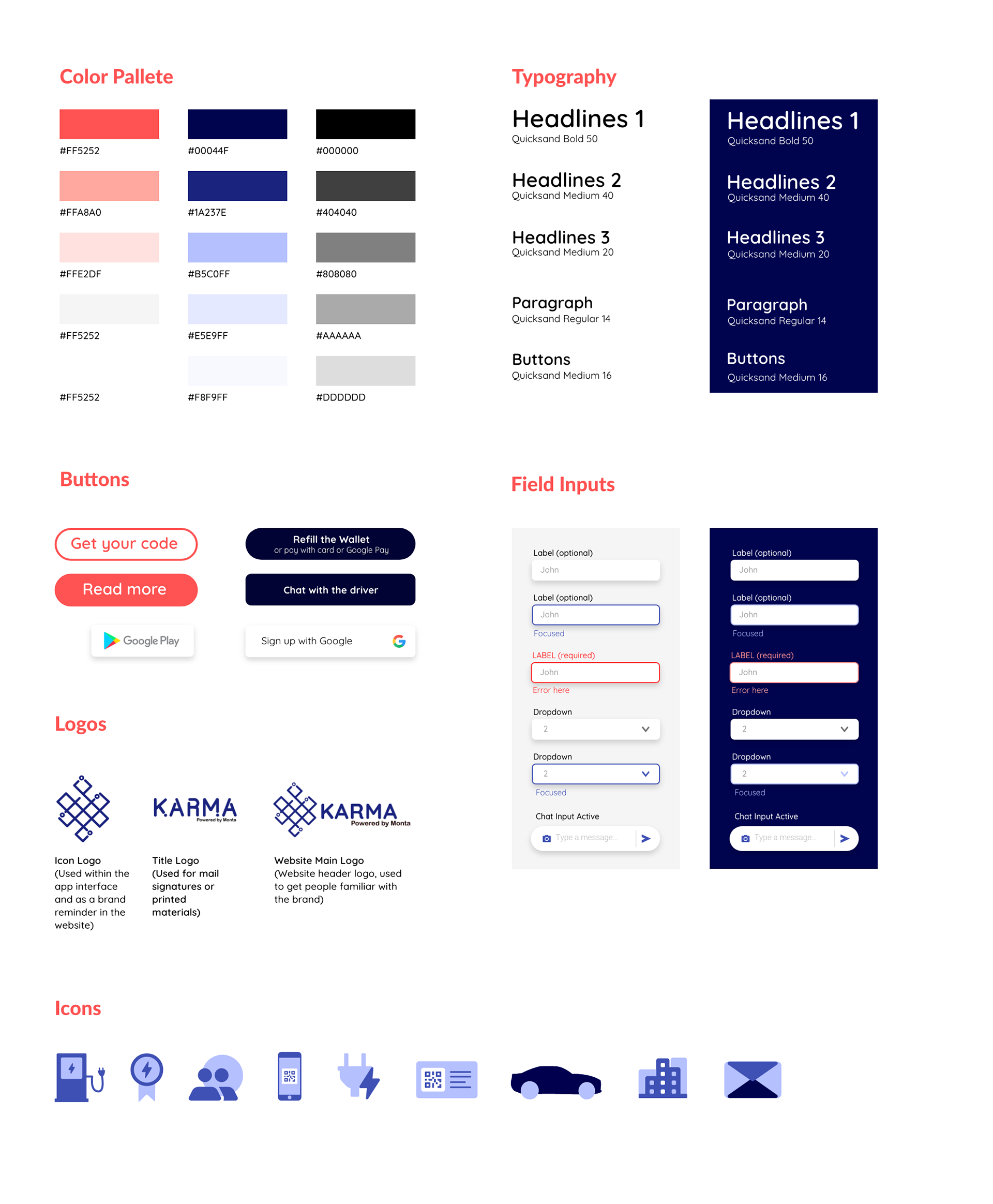
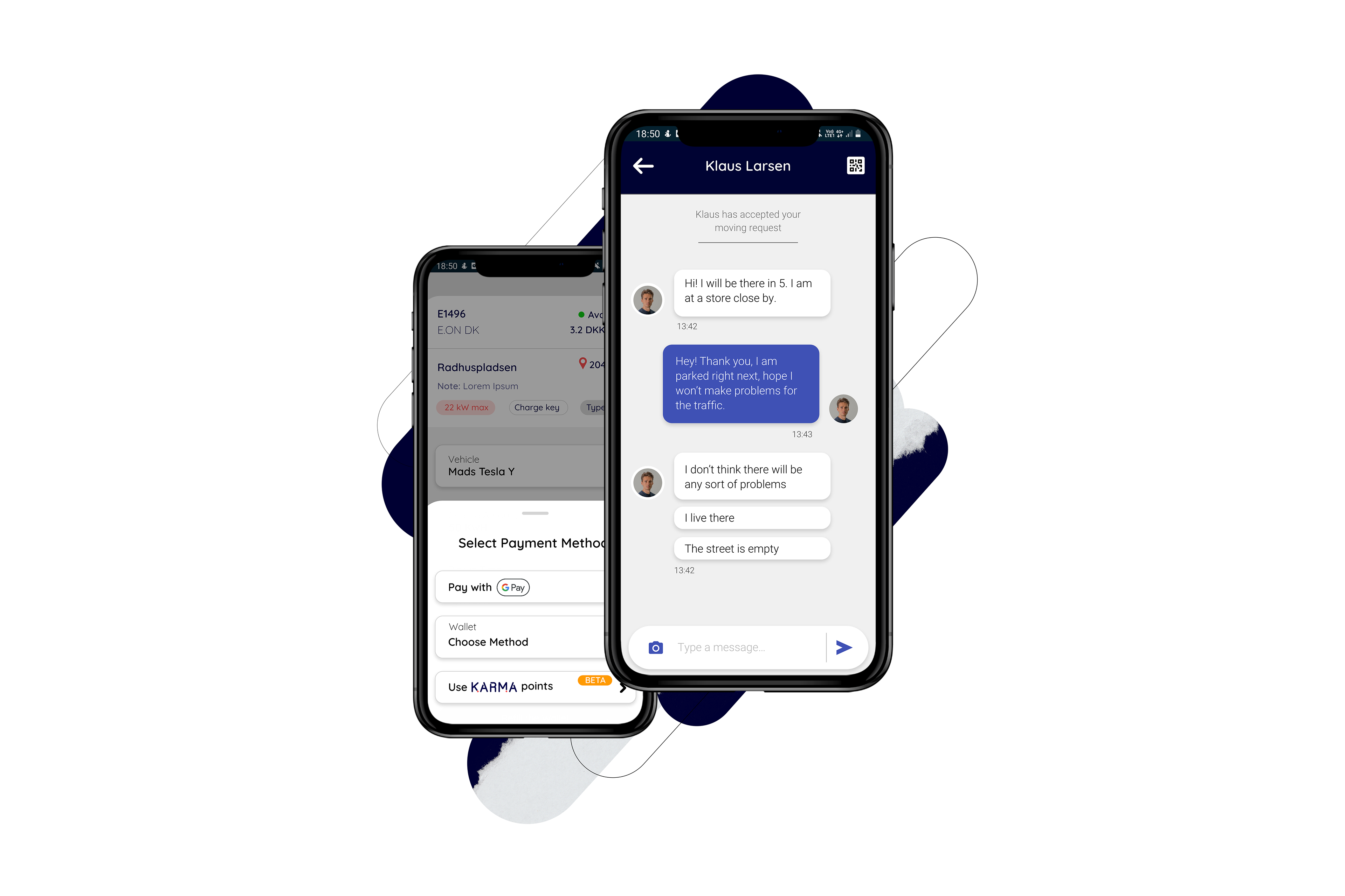
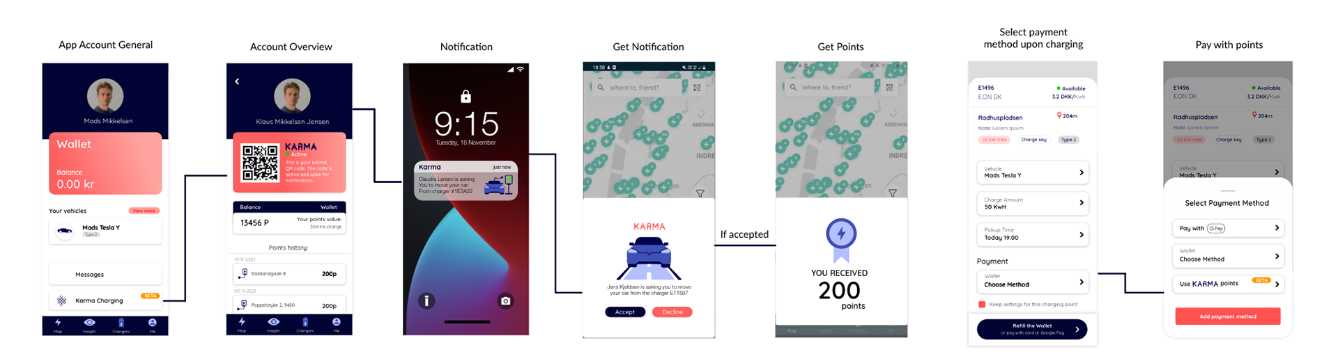
The app integration involved creating a new flow in which the user could have a separate wallet from the one for charging, where he could have a history of requests, where he could see the points he earned and where he could communicate with the other drivers, in order to have the car moved. We have used the visual identity of the MONTA app and adapted its design to our customer needs, maintaining the consistency of the design.