Barry Energy
Website Redesign. App Co-creation. Content Production
About Barry:
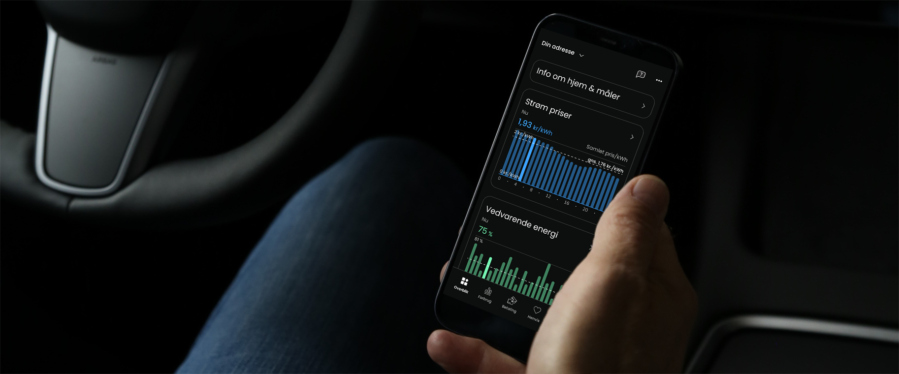
Barry is a 100% digital electricity supplier that makes it easy for you to get smarter, cheaper, and more climate-friendly power. By providing full insight into your power usage data, you can take full control of your energy consumption.
Client:
Barry Energy
Problem:
The website was not aligned with the app
Solution:
Designed a new website, contributed to product meetings, created promotional animated content
Role:
Digital Product Designer. Content Producer
Role and Responsibilities:
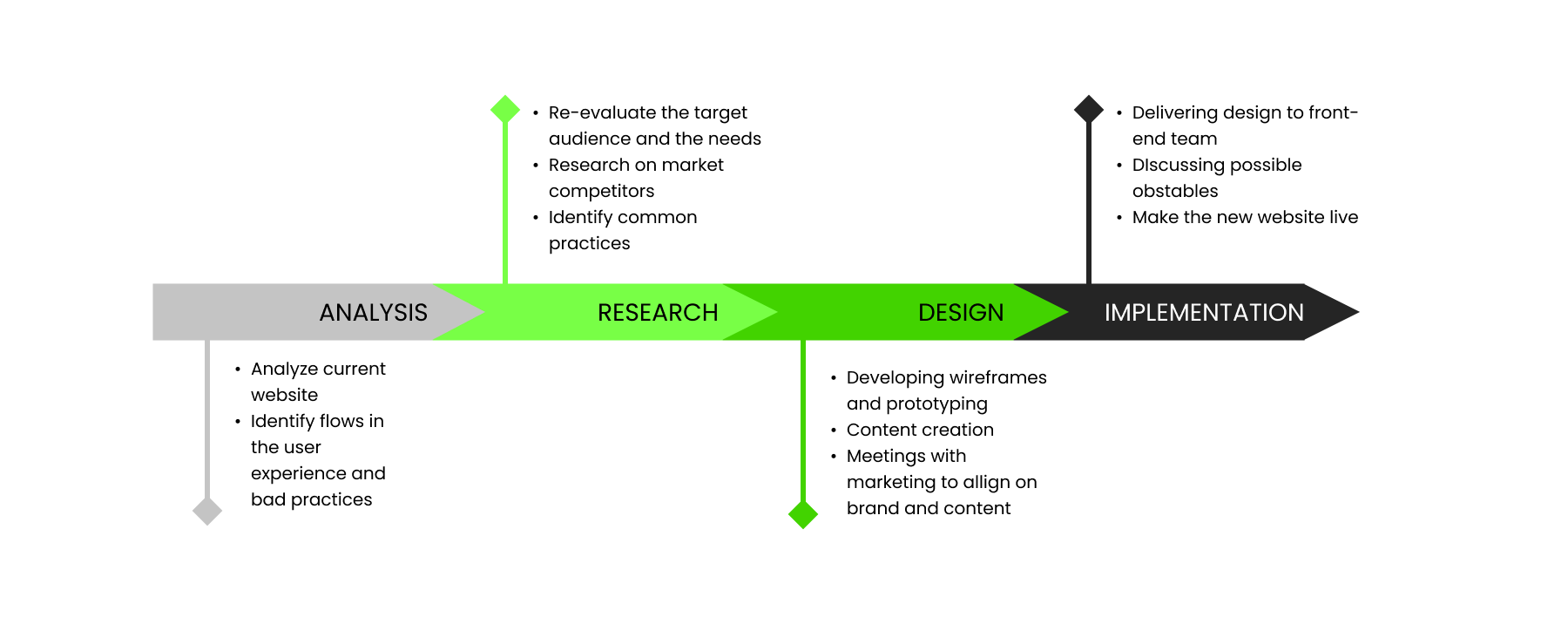
During my time at Barry I worked as a bridge between the product and marketing departments, covering different design tasks and projects, including a website revamp, creating a new on-boarding flow and contributing to the app UX . The challenge was to develop a coherent product both on web and app, adapting it to the the market standards while collaborating with the marketing team to make sure everything stays on brand.
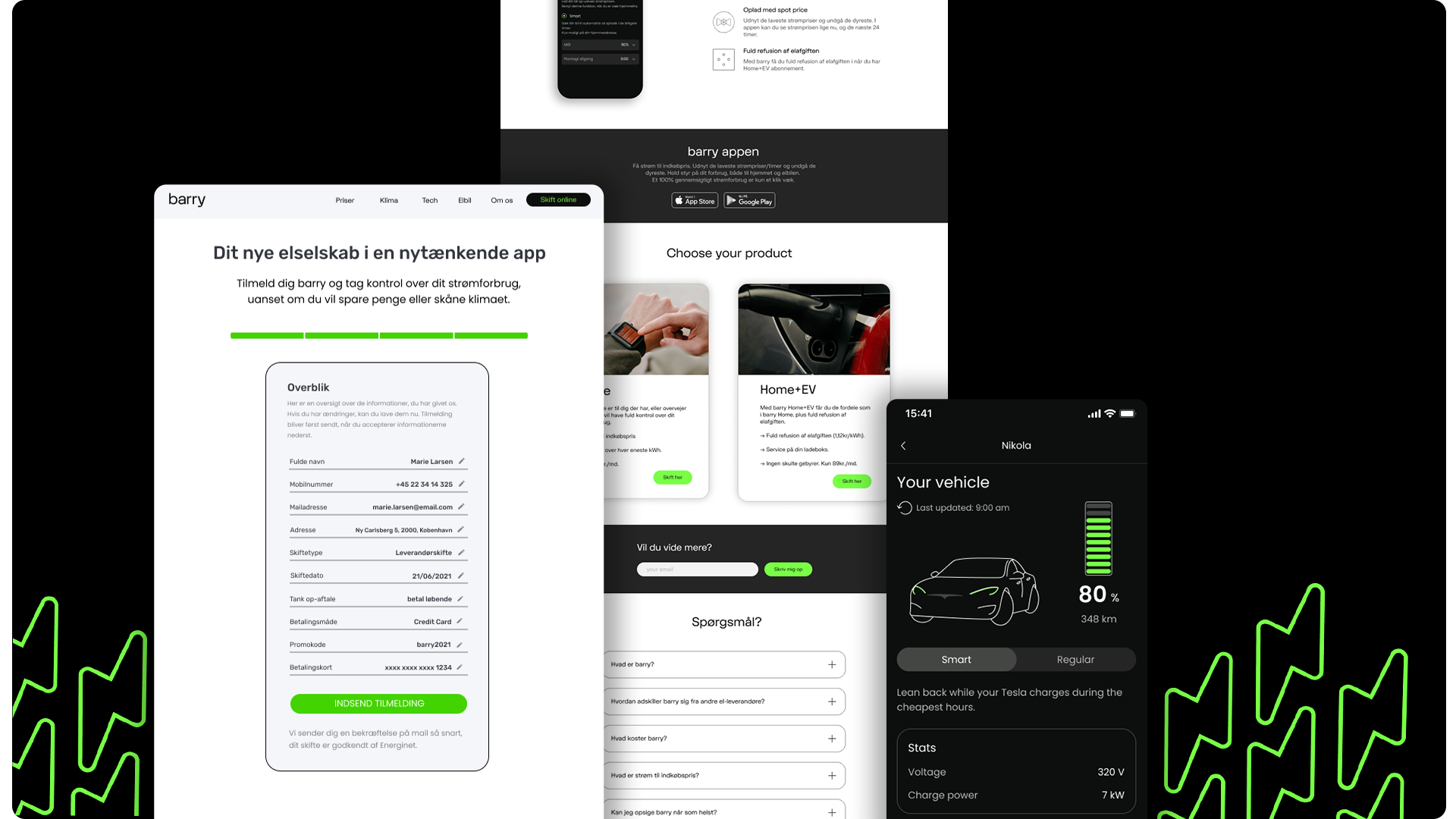
Website Redesign
Before joining the team, the company completed a whole rebranding process, including a switch towards the Electric Vehicle (EV) owners, a fast growing community with promising prospects. The rebranding included plenty of new brand elements that have been translated into the website design with unsatisfactory results. I took ownership for the redesign project, starting with a full analysis of the current website to identify bad practices and flows in the user experience.
The next step was to re-evaluate the purpose of the website along with the target audience, and the market direct competitors, a process in which I worked closely with the marketing team. We established a list of things that needed change and brainstormed possible ways to improve the number of conversions.
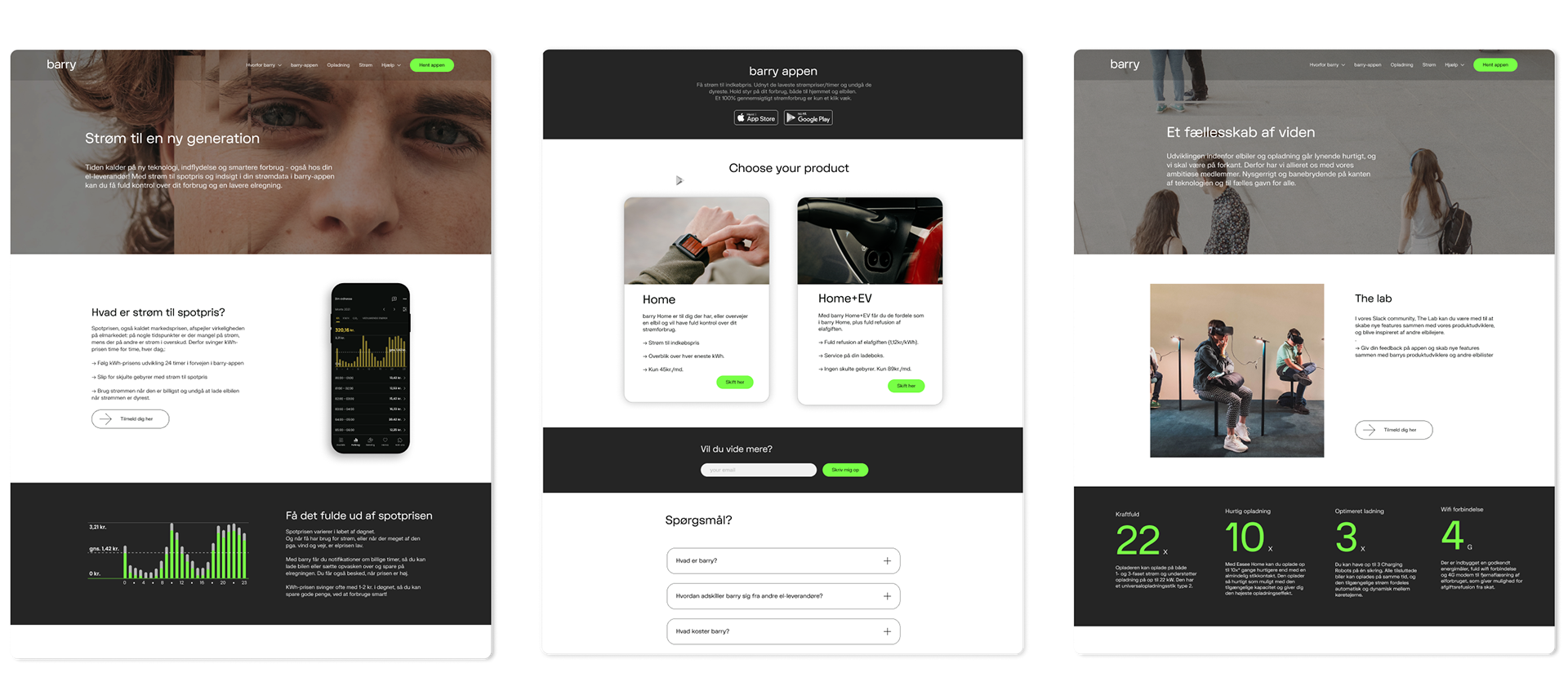
The new design was heavily influenced by the EV switch, so we decided to push the smart charging feature right below the fold of the landing page to redirect attention to the benefits. We went for a more visual approach, using images for the hero section to illustrate a real use of the product, a common practice on the market and fitted for the target audience. The focus changed from the green backgrounds to a darker theme, closer to the design of the app, with neon green used only for highlights.
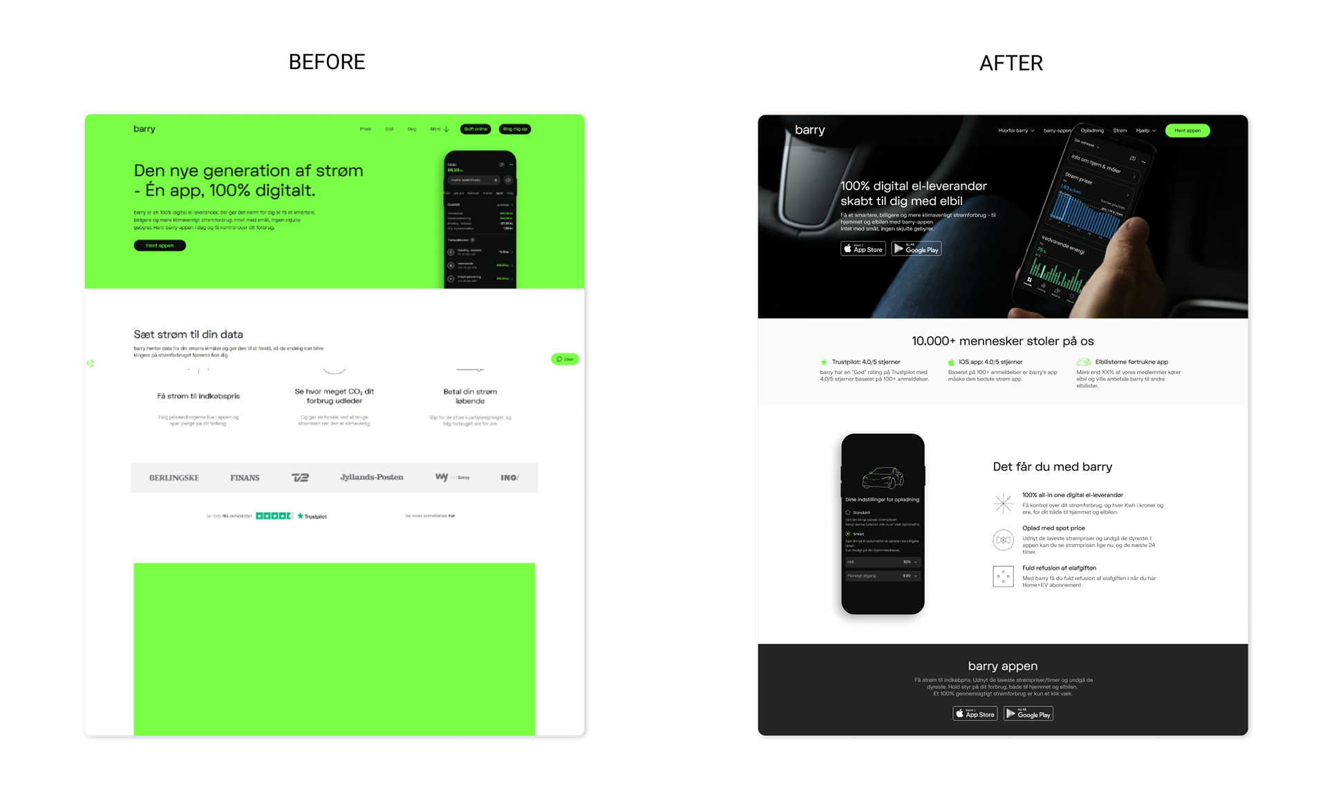
We added two different product packages for the "Home" and "Home + EV" on the landing page so we can facilitate the user journey to purchase point. Moreover, we tried to implement more data visualisation to better support the company goals and mission. To create dynamic we broke the layout with full width columns to attract attention to certain elements or messages.
Final Result
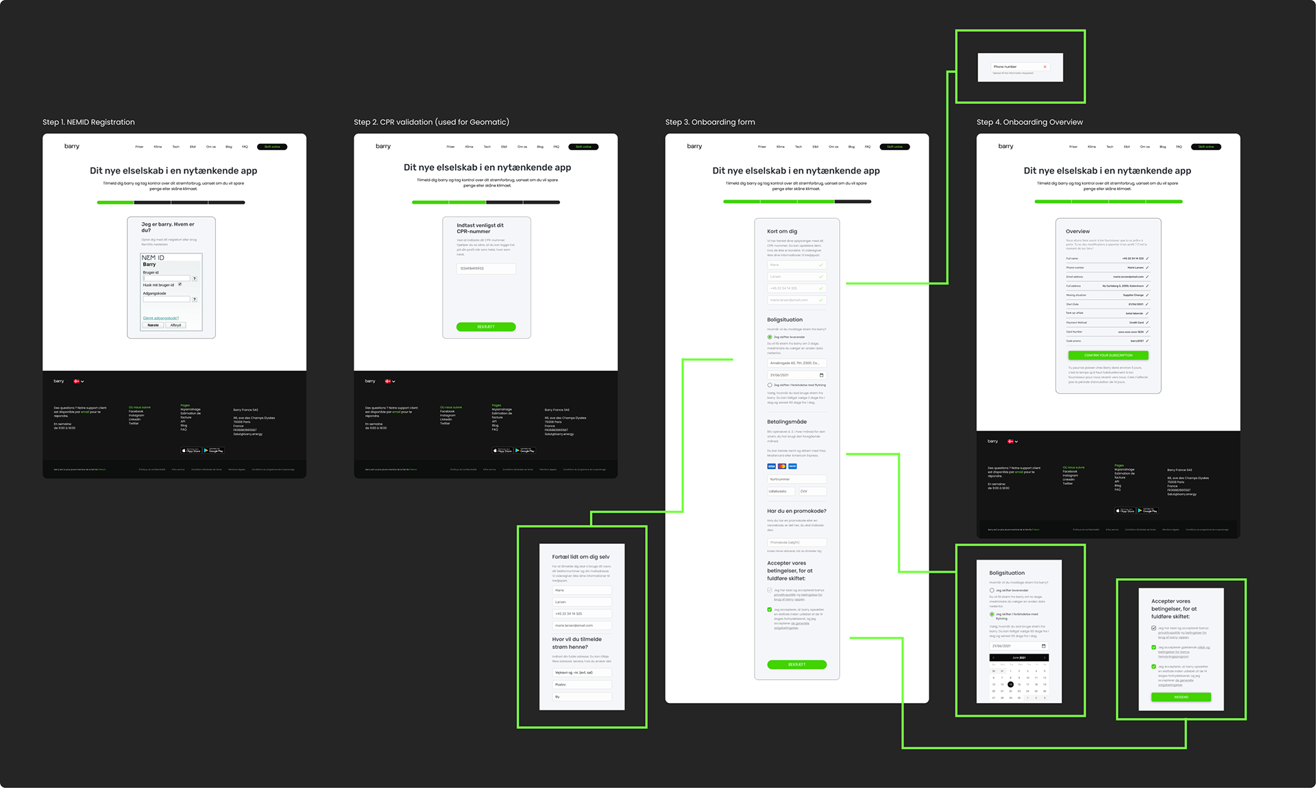
Web-Onboarding
The web-onboarding flow on the old website was a long and tiring endeavour where the user could only fill one field at a time, which ultimately led in a 13 steps process. Moreover, the design of the page was misaligned with the rest of the website and not fully responsive (see below).
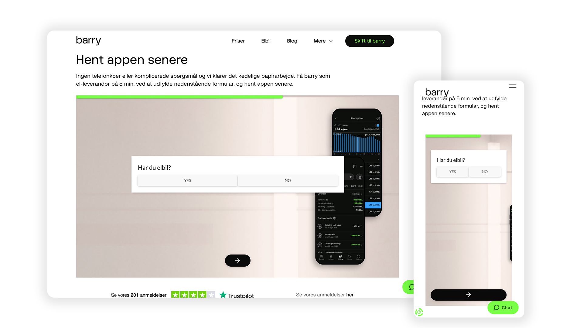
To ease the process, together with the front-end developers, we decided to make a NEM ID (keep up with the app) authentication system followed by a CPR check (Step 1 and 2). To make sure we take the least amount of time and cognitive load from our users, we decided to use Geomatic for fetching the basic information of the user (name, email, phone-number) and autofill the fields in the form (Step 3) .
We went for a one page form to ease the navigation through the input fields as well as making it easier to change, update. We kept a simple design, using the main colors of the website and acknowledging the white space. We removed the images from the pages to avoid any possible distraction from the form.
Final Flow
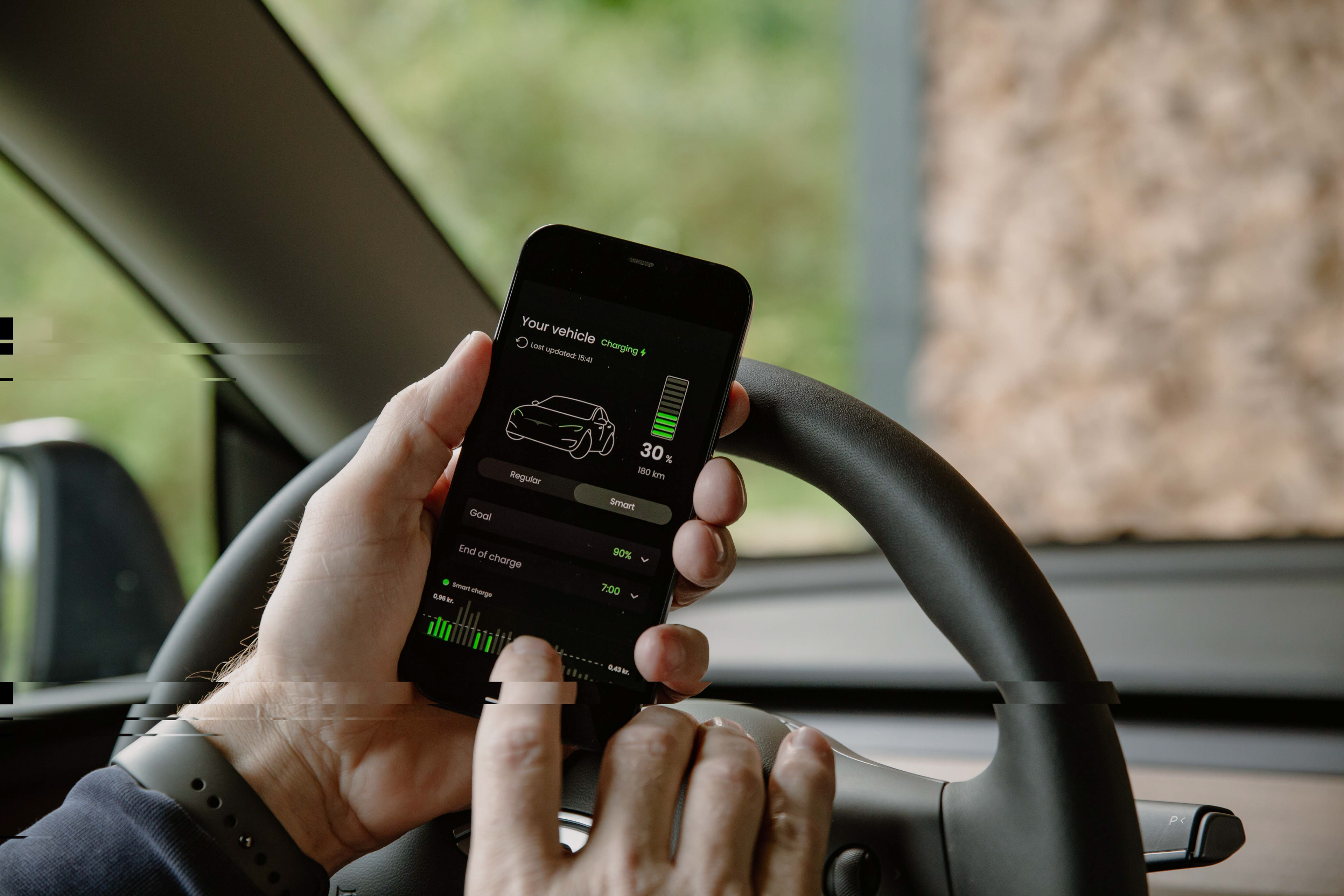
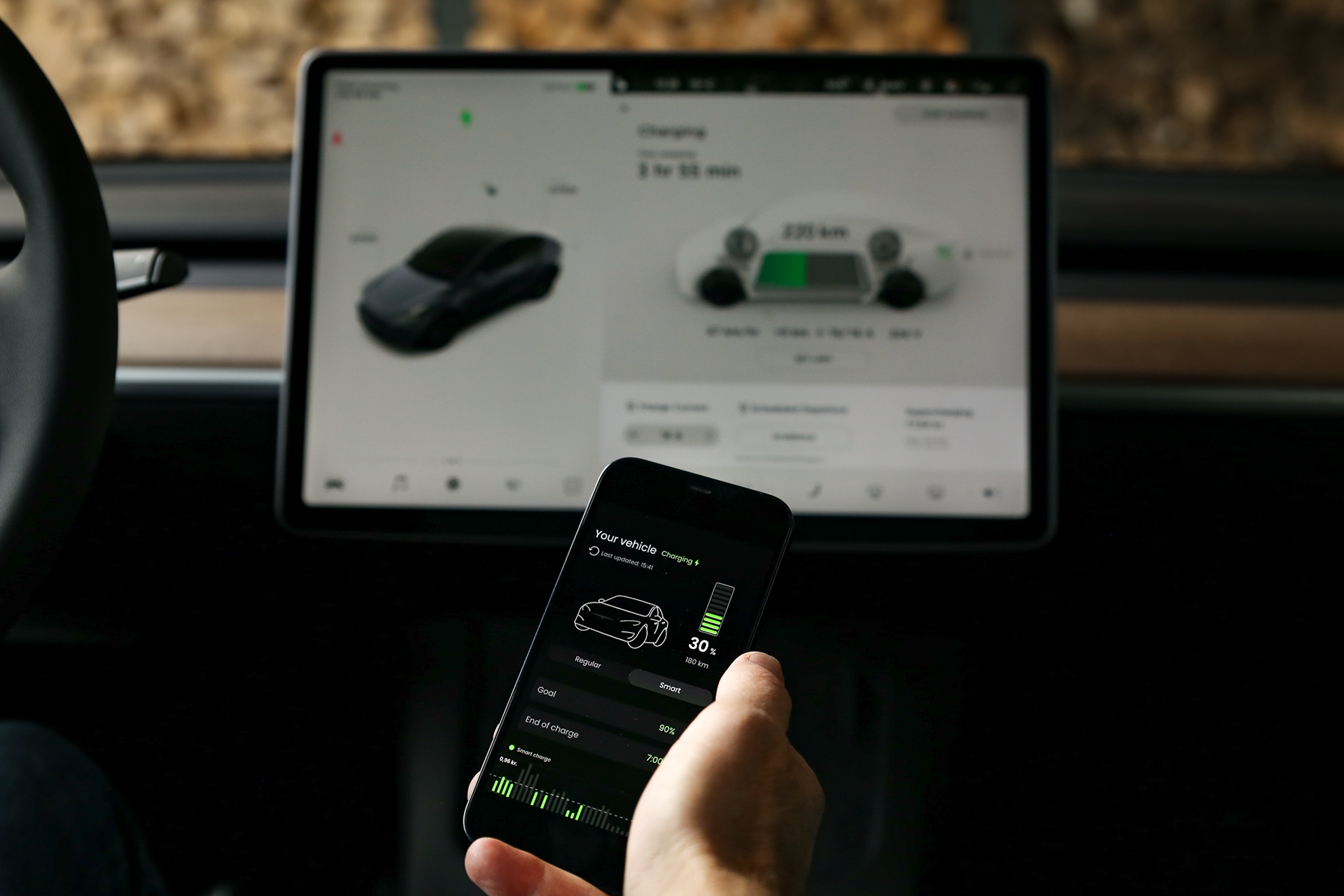
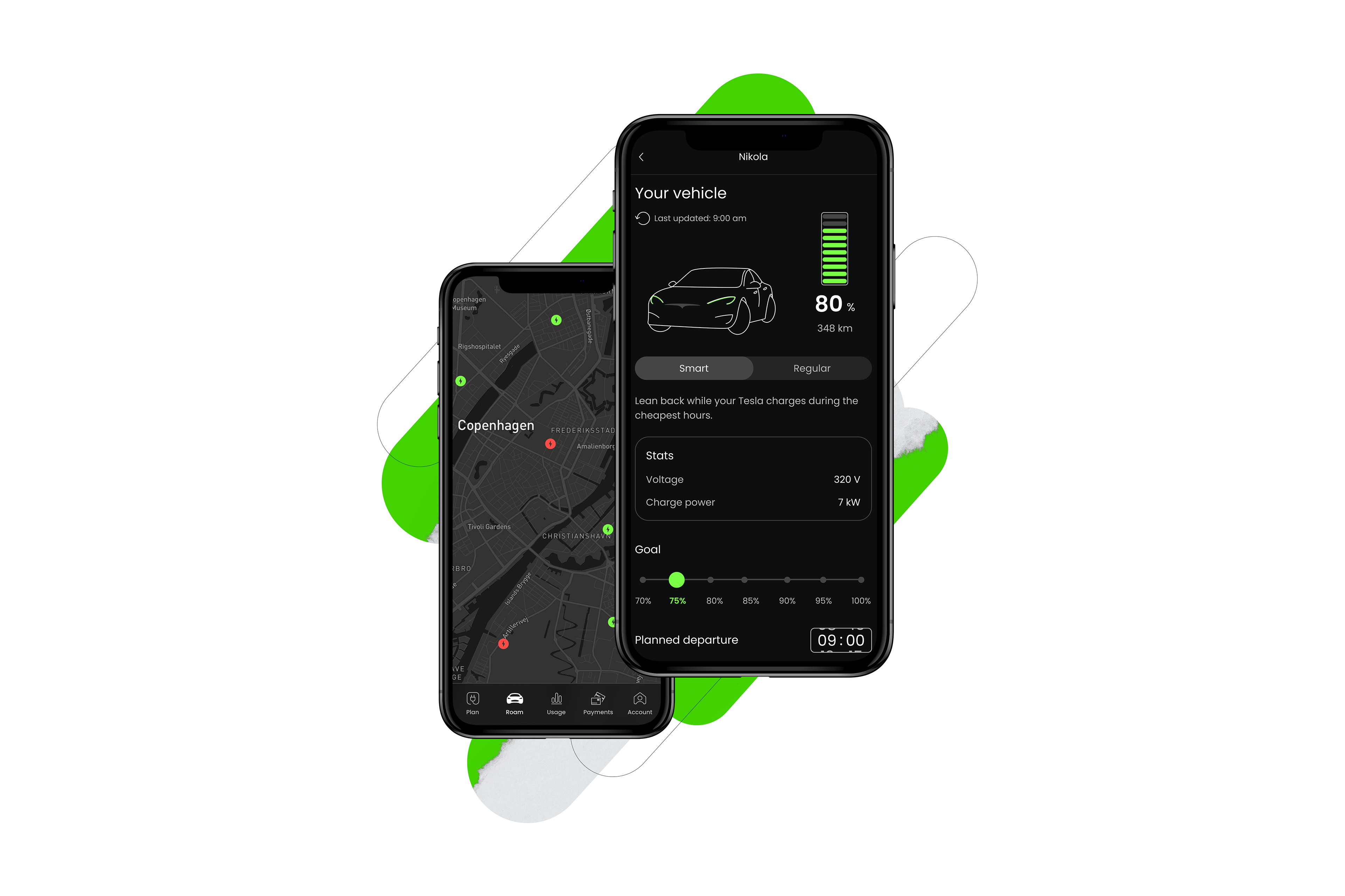
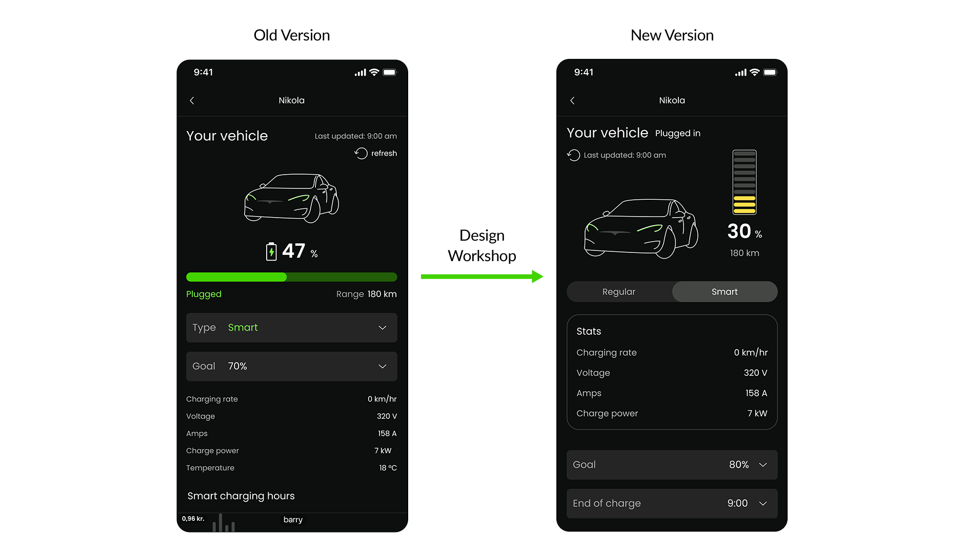
Tesla Smart Charging Screen
The creation process of the EV smart charging screen was my first direct collaboration with the Product Team, where I took part in design workshops and collaborated to develop and improve the app interface for the feature.
The process was an ongoing "back and forth" between the product team and the users who tested the feature, as we all considered that involving the community directly is the best way to build the ideal product for their needs.
Later on the design was re-altered based on user testing and feedback, but sadly the design never made it to the full implementation.
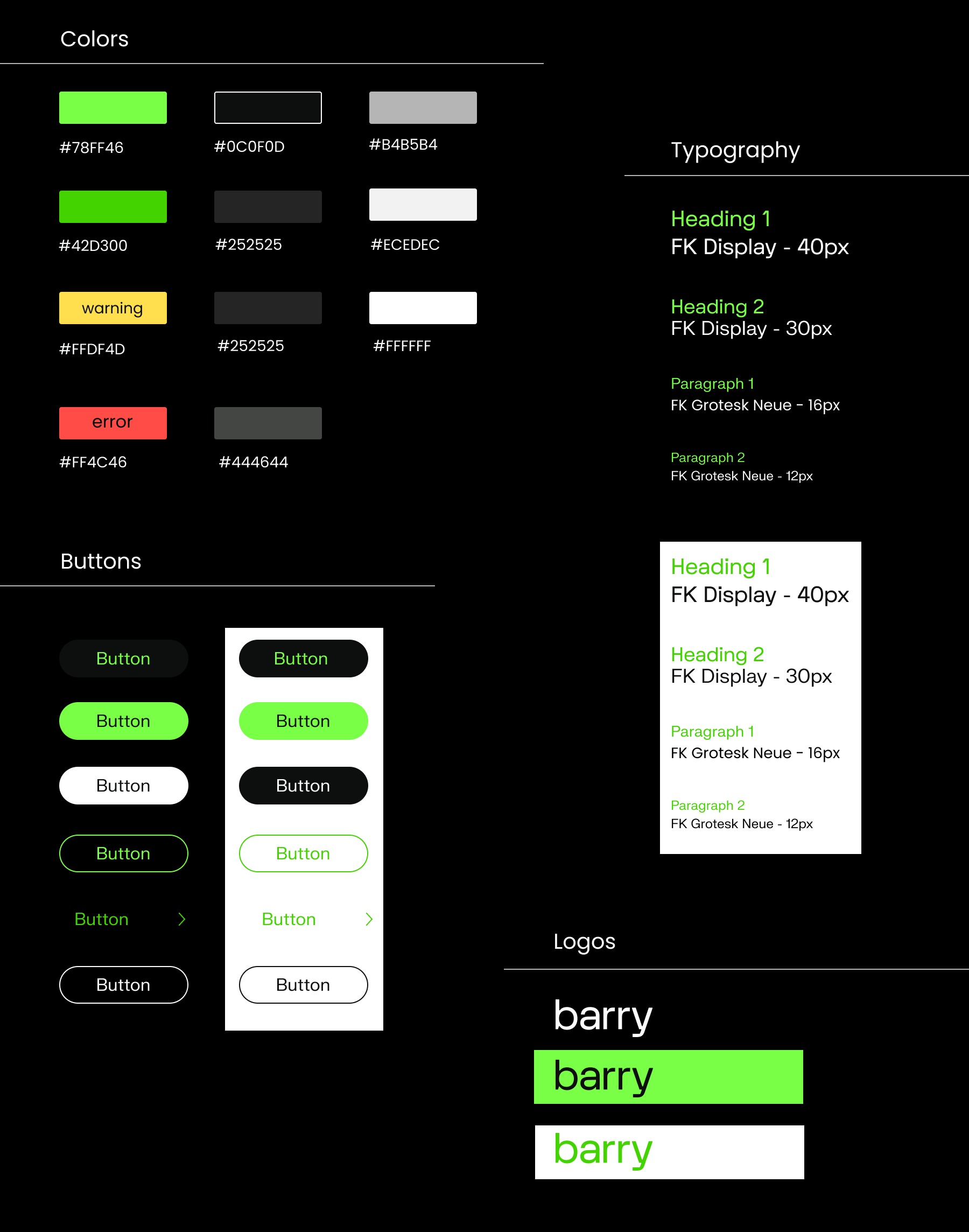
Using a design system with predefined basic elements and colours is crucial in developing a coherent and consistent product. All the prototyping and design missions I took were in accountability of the design system, which made any changes needed later easy to orchestrate.
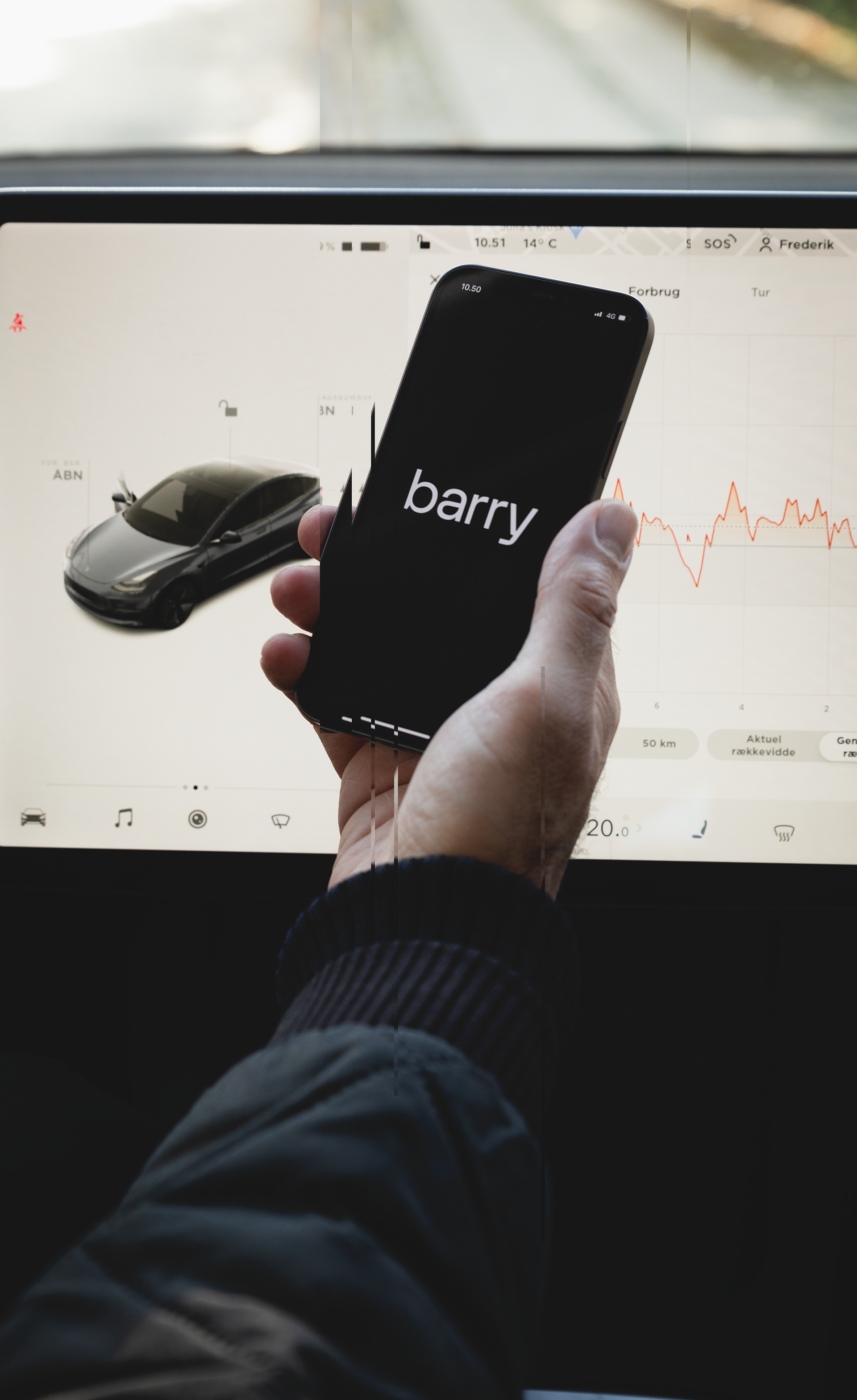
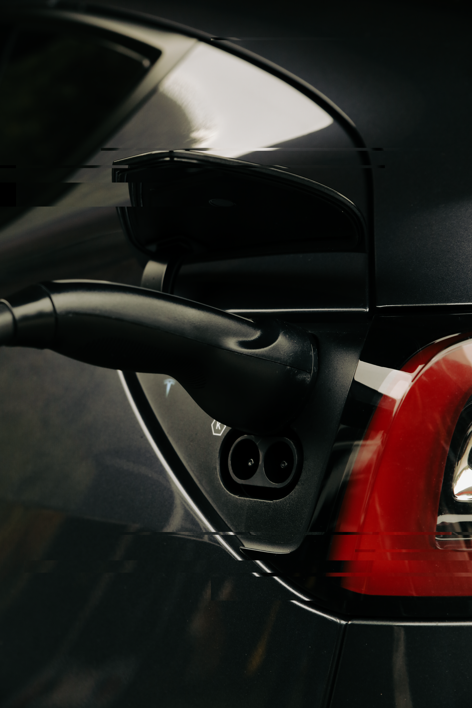
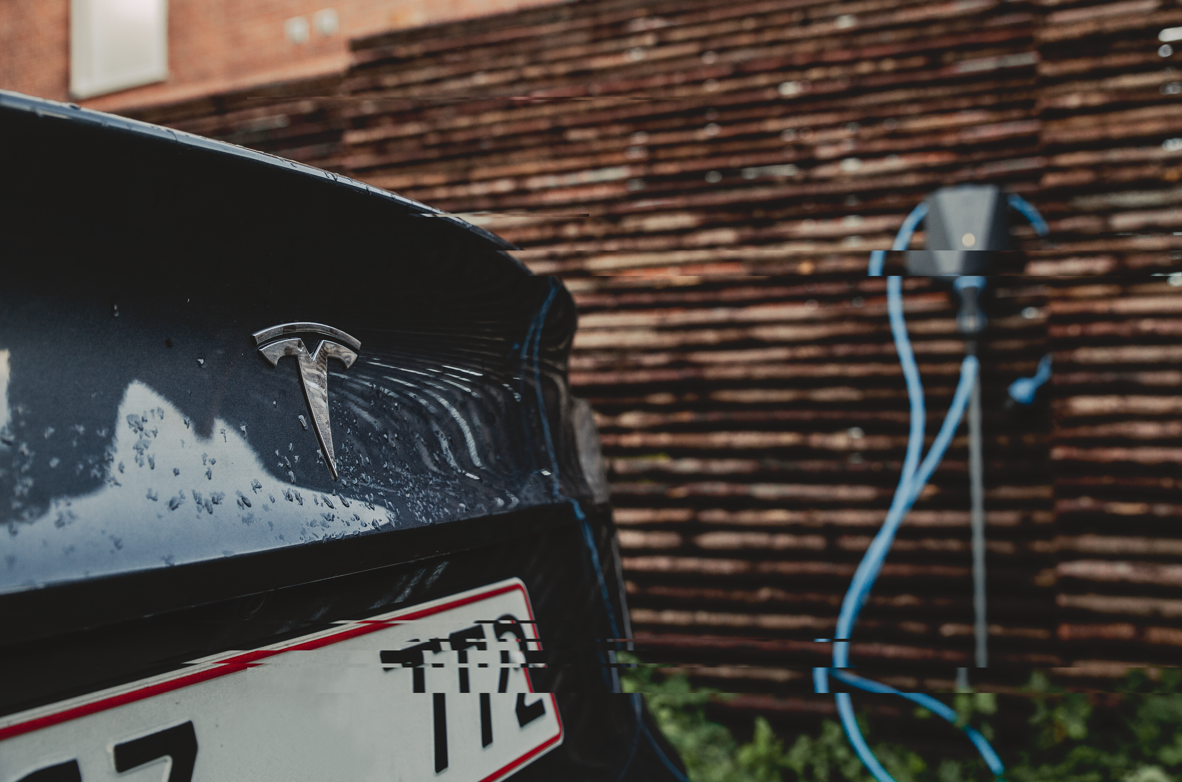
cONTENT PRODUCTION
While graphic elements are always a good solution for keeping a design simple and efficient, images are the one element that helps the user identify more with the product in a day to day life.
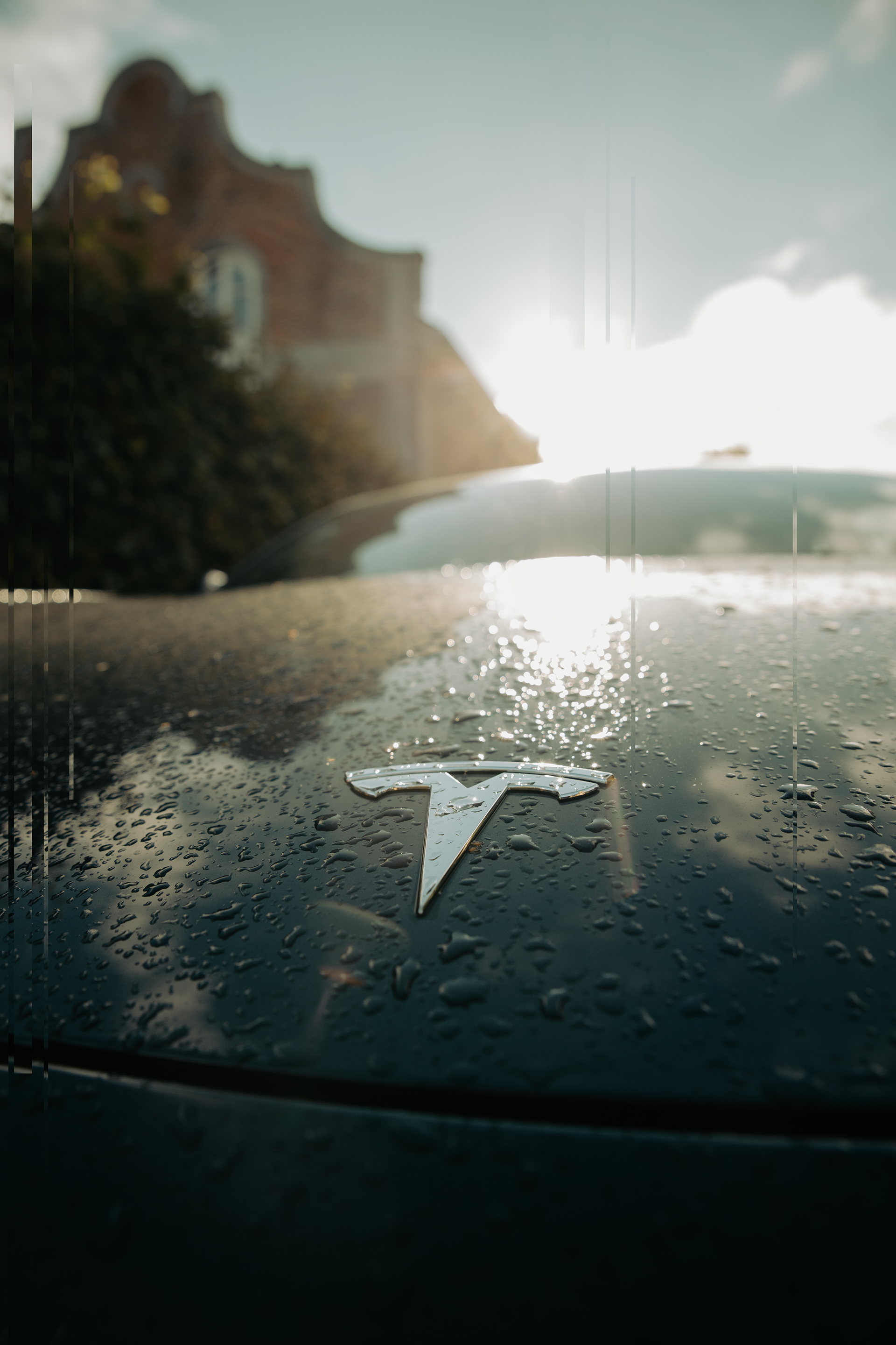
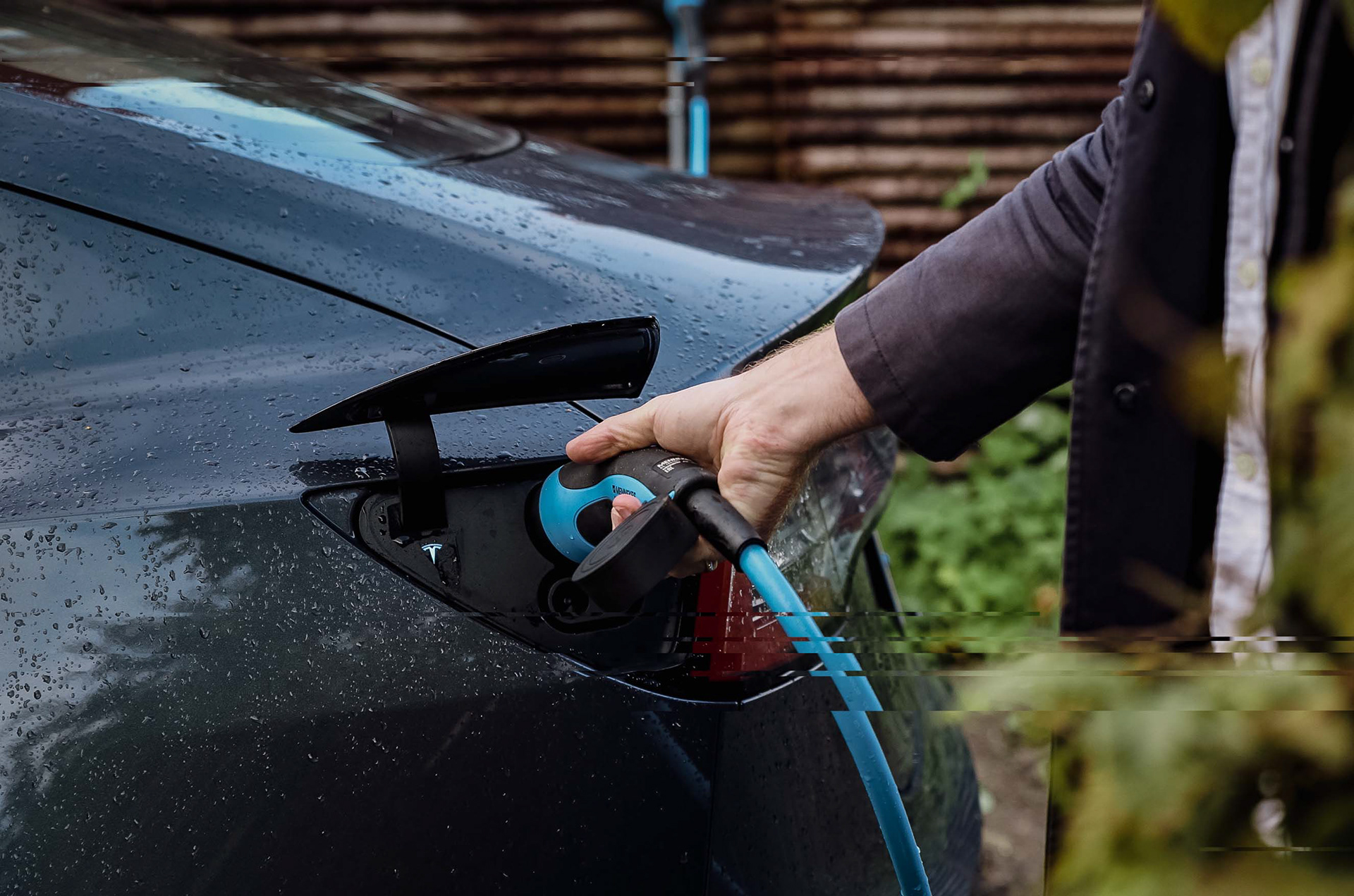
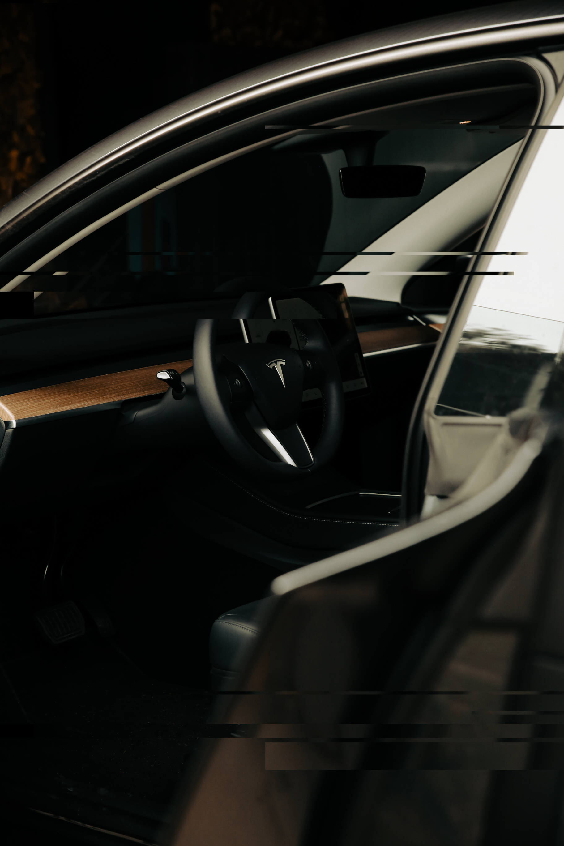
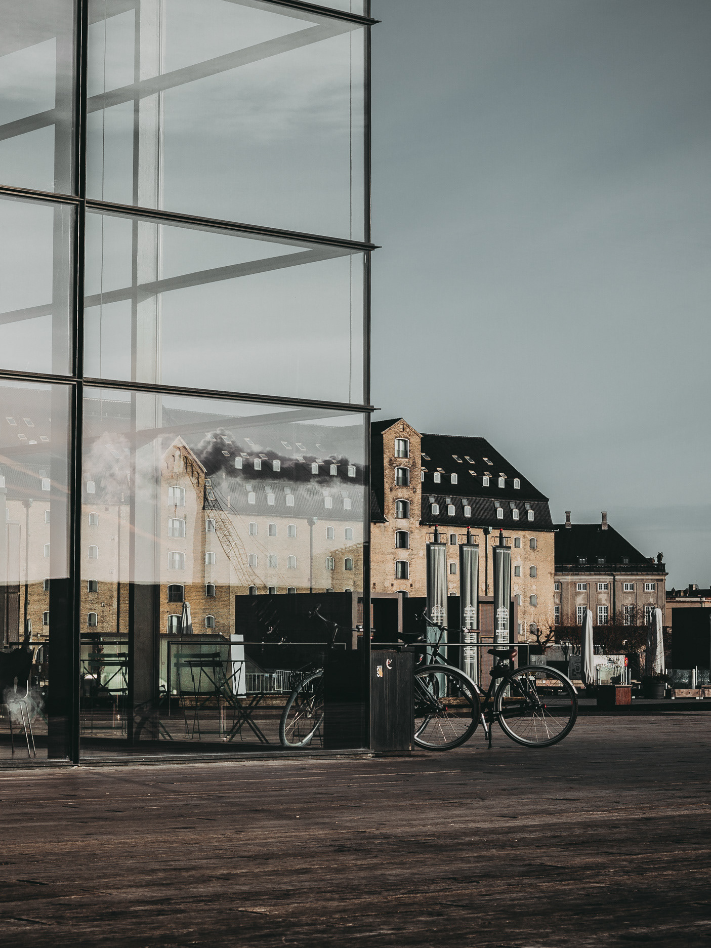
During the redesign of the website I took the responsibility to create a part of content we needed to promote the switch to the EV owners. Together with the marketing team we organized a couple of photoshoots around Copenhagen where we took photos of people using the app or driving their car.
We aimed to showcase the easy flow of using Barry as well as realistic situations for it. To support the end goal, I created an "tutorial-like(how it works)" animation together with the product team, where we explain how to access and use the EV feature in the app. The content went both into SoMe materials as well as the website.